Navigation Page

Sunday, 30 November 2014

Live Every Moment - Sketchabilities Sketch No.128

Hi,
this is my second layout I have for this November for Sketchabilities with sketch no. 128 below...
here's my layout for that
I think I always have to struggle a lot comes to red color. I'm not really good at it. But, if come to adjust it with black, I always like the results coming out of it. Quite bold, but still I like it.
here's more detail....
 For the background, after creating some Masking Tape to mark where my photo and embellishment should go, I did some gesso first... then I sprayed it with Dylusions Ink Spray - Bubblegum Pink, Cherry Blossom, Postbox Red, Black Marble and a little bit of Lemon Zest. A few stamping done with Prima - Finnabair and Distressed Crackle Stamp from Creative Embellishments. After all the chipboards and flowers placed and glued, I used Inka Gold Paint - Magenta to add more stronger red-ish look for my background. Then I did a some gesso in every edge of the flowers and chipboards.
And here's our sponsor for this challenge
Creative Embellishments is a new family owned company that was created by Michael and Nicolle Kramer. We are a husband and wife team who design and manufacture unique, high quality  chipboard and wood products. It is our mission is to offer fun and inspiring products to bring out your inner creativity that you can add to any project. In the near  future we will be expanding into other mediums such as rubber/acrylic stamps and acrylic embellishments. 
  
Creative Embellishments is offering up a $20.00 gift card to their online store.  In order to Qualify for this Gift Certificate you will need to complete the sketch below and link using our linky system, by the due date December 13th. 
Hope you all like what I made and thank you for stopping by, but don't forget to check the other Design Team Member, they have amazing layout as well to see.

Hugs,

Merry

Saturday, 29 November 2014

Tea Of Love - CSI Case File No.148

Hi there....
this week CSI (Color Stories Inspiration) has a new file No. 148. To be honest, I love all the case file they have, but somehow this week is my favourite...!!! Here's the moodboard....
Here's my layout...
The Color Scheme: Grayish Green, Light Lemony Yellow, Light Coral, White and Celadon Green.
The Evidence: Teacup Accent, Flowers, Birds, Watercolor, Tag, Staples, String and Pen Work.
The Testimony: I wrote my journaling as a recipe, here's the close up look....
So, straight away when I saw the case file, I remembered that one time I've watched a video in Youtube made by Vicky Papaioannou (here's the video) about stacking cups as well and I thought I would love to do it similar. But in the beginning, I was struggling with what photos would made my layout perfect. Somehow, my sister (Linda), she sent me some photos of my baby (well, she's no longer baby anymore but still, I like calling her my baby) last September, and I thought the picture of her together with her cousins would make this layout looked great. I cut all the pictures and pretended that they're little mouse, fighting for some "love".
I was looking at the recipe quote and found this recipe which I thought as well would be perfect for the journal. I added a few ingredients myself, you could see the ingredients on the picture above (on every small tags hanging on the cups).
If you don't know what paper to use, then I suggested that you try with white paper. That always work best for me. So like always, I prepared my background with some gesso and Dylusions Ink Spray - Squeezed Orange and Black Marble. I added some masking... so my page didn't look so empty. I started to draw 4 cups in different kind of pattern papers, cut them and colored them with Caran d'Ache watercolor pencil (it's one of my treasure).
I distressed the edges with Distress Ink-Tea Dye and used this as well to create a teacup accent around my page. For the chipboards, the easiest way and still the nice way, I always color them in black and put some Inka Gold from Viva Decor, and this time I used Old Gold. Comes out perfect, as always...
Hopefully, I gave you all the details you need... if not, just let me know and will gladly to help you out.
Thank you for stopping by and hope to see you again...

Hugs,
Merry

Wednesday, 26 November 2014

Yvonne Yam - Do More With Less

Dear all....
Have you ever heard of Do More With Less? It's belong to a talented lady called Yvonne Yam. She's from Singapore. Her works are gorgeous. And you know what... she's our guest designer of November 2014.... Yeaaayyyy!!! Here is her canvas project using our chipboards....
How amazing is that! Look how she did the flower clusters and what cutie pies on the pictures... How much details and how much love she'd put in the layout! WOW!
If you would like to see more details or more of her wonderful works, you should definitely check her out HERE
Thank you again for stopping by and please don't forget to leave her nice comments....
Hugs,
Merry and Linda

Saturday, 15 November 2014

Cherish - Sketchabilities Sketch No.127

Dear all,

how exciting to be part of Sketchabilities Design Team!!! This month is my first month to inspired you with the first sketch (no.127)......
and here's my layout for that....
I thought I wanna use these three photos anyway when I printed them. But I didn't know for what kind of layout until I've seen the sketch above. Such a perfect coincidence. These photos were taken last June in Indonesia. We were having holiday in my country for a month. She is my cutie pie. I would say she's my everything. Every second I thanked God that I have her.
So, here's the steps... I created a circle of gesso at the back of my photos and then masking it with circle form. Then I did a lot of stamping to create a stronger look around the photos using Prima-Finnabair (Vintage Vanity Collection-Threading), Prima-Finnabair (Vintage Vanity Collection No.4) and Prima-Create Memories. Here's more details..
I thought, if I made a little bit of an accent with the color, then the 'turkish' background paper will stand out even more, so I decided to add some Cosmic Shimmer H2O - Blue Lilac a little bit here and there...
I love flowers to be honest, but always at the end of a finished layouts, I'm having trouble storing my layouts because of the thick flowers I've used. Somehow, I got inspired by Anna Rogalska, she used her flower's photo into her layout. So I did the same and I love the result. :)

Would like to join the challenge that Scraps N Pieces made for November with the theme below
Thank you for stoping by and please don't be shy to leave any comments or even critics... would love to hear from you :)
Hugs,
Merry


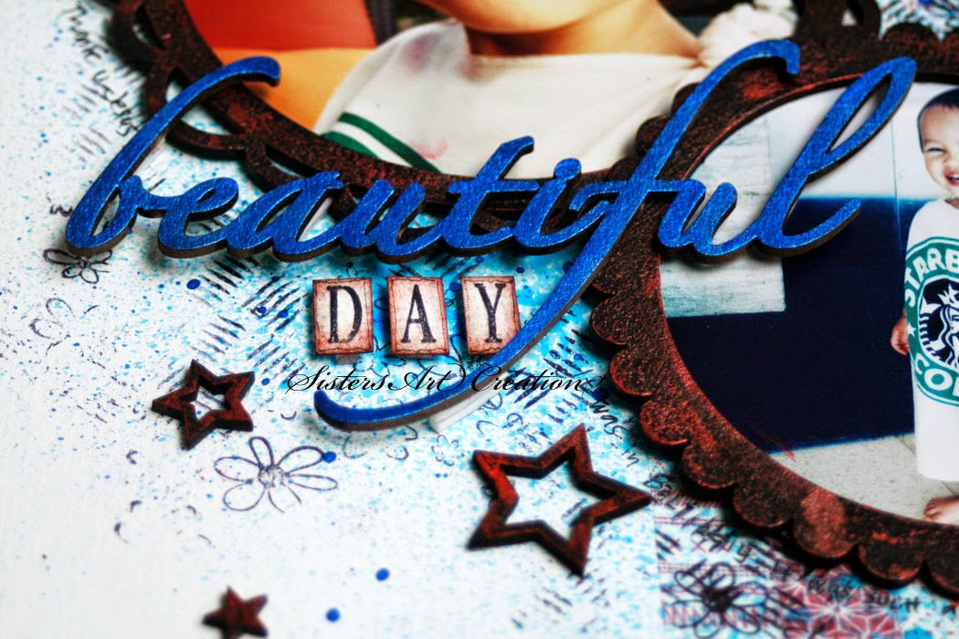
Beautiful Day - CSI Case File No. 147

Dear all,
here's another case to solve from CSI (Color Stories Inspiration) Case File No. 147
Here's my layout for that
The Color Scheme: Light Slate Blue, Slate Blue, White, Bright Cherry Red, Black.
The Evidence: Circles, Stripes, Stars, Stamps and Stack Something.
The Testimony: I used the word "day" as my title and my journaling. It was written around the frames. It's about our holiday in Bali last July. It was such a beautiful day after 2 weeks stress. Both my husband and my baby were totally sick because of the weather and the food. I didn't have enough sleep or even could enjoy being home. But somehow in Bali, even though was just 4 days, we had a terrific day. Even it was so perfect as if it was meant for us to enjoy the day. Thank you Jesus for this!
I started with white paper as I don't have much color paper in blue. I did some gesso all over the page. After it dried, I apply some masking tapes with red color across the page to match the sketch.
Picked up some circle chipboards, colored them black. Before I glued them to my layout, I sprayed it a little bit with Dylusions Ink Spray - London Blue. I stamped them with Kaisercraft Clear Stamp - Checker Plate. Here's more details.....
The title was also chipboard colored with Luminarte Acrylic Paint - Pearl Blue. I added a few stars on the corner and splattered them again with the same color I used for the title.
Hope you enjoyed it. Take care...
Hugs,
Merry


Saturday, 8 November 2014

Family Getaway - CSI Special Case File No. S365-9

Hi,

I'm back with my second layout for CSI (Color Stories Inspiration) Special Case File No. S365-9 with the mood board below
and here's my layout
The color Scheme: I used all the colors which are Khaki Green, Ecru, Warm Grey, Bright Golde Yellow and Bright Pumpkin Orange.
The Evidence: I used Leaves, Mist,Watercolor, Metal, Fence, Scatter something and String.
The Testimony: I used inspiration word "Away" and I handwrite my journaling around my page which about our staying in Berlin that turned from chaos to joy. We were having so much fun that evening... the two of us with great beers in our hands and her with sand all over her dress and shoes. She was even refused to get photograph since she couldn't separated herself with all the toys and of course sand.
Here's more details....
I started with white paper because I wanted to play with my own background this time (that's also  another excuse that I have no idea what to do, lol). I did some masking tape to start my background. Gesso them couple of time. Started to spray with Dylusions Ink Spray - Lemon Zest, Black Marble and  Squeezed Orange. I arranged where my photos and embellishment would be, then before I glued them all, I used stamps from Creative Embelishments and Prima - Finnabair to create a better background. Then I splattered more color with Cosmic Shimmer - Yellow Sun and Orange Gold. Once I was happy with the result, I started to glue everything and add the final touch with Lumiere Acrylic Paint - Metallic  Olive Green to match all the color scheme from the mood board.

Hope you all pleased with my layout, thank you for your comment and please come back again....
Thank you for being here...
Hugs,

Merry

Tuesday, 4 November 2014

Lo shakerato Alberto

Dear all,
how are you doing? Hope you're all not only in a good condition but also in your best.....
Somehow, I would like to express my gratitude to Lo shakerato Alberto for being our Guest Designer of November 2014. Not only that he's nice and gorgeous, but also he's a very talented person. His coloring are unbelievable... the way he put every embellishment as well is amazing.
Here is one of his card using our chipboards....
You can check more of his projects in his blog here. Don't forget to stop over by him....

Hugs,
Merry and Linda

Monday, 3 November 2014

My Good Adventure

Dear all,

can't believe it's already November. How times really flies.... can't believe that it's my forth layout with 123 Challenge blog. So here's another moodboard from 123 Challenge Blog....
and here's my layout for that...
The picture was taken in Scotland. It was an amazing holiday with 3 good friends of mine. 
We were driving from Manchester to Edinburgh that time. What crazy about this, I was driving from Edinburgh back Manchester without having a driving license myself at all because my friend who was supposed to drive was too tired and I thought, I know how to drive except that I only had an Indonesian driving license(and he was ok with that). It was a good drive though. What an amazing feeling afterwards. But when you think about it, how much and what strange things you would do when you were young... I can't believe it myself. It's was a good thing that nothing happend that day. Thank God for that. And that was almost 9 years ago but still it was a good experience.
So here in my layout I decided to do it as "My Good Adventure, Good Journey".
I stamped the background with different kind of stamps. The chipboard I used as my skirt to make the whole body of mine and I colored it with Inka Gold - Cooper. So it is with the background chipboard I used behind my photos, I colored it the same color to match to color palate.

Hope you enjoyed my creation as I did enjoy making it... have good day everyone... God speed.

Hugs,
Merry

Sunday, 2 November 2014

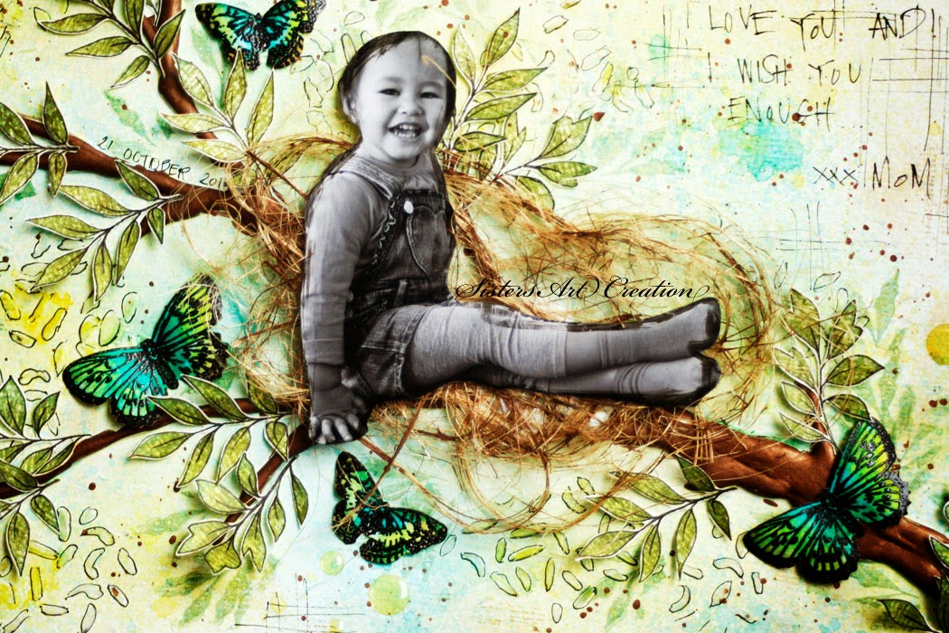
I Wish You Enough - CSI Special Case File No. CC-3

Dear all,

how time's going so fast!!! It's November now and it means my first layout (yeaayy) as part of Design Team a.k.a CSI Detective at CSI (Color Stories Inspiration) with special case no. CC-3 (for TV Show) with the mood board below....
here's my layout for that...
The Scheme : Turquoise Blue, Light Yellow, Chartreuse, Marshmallow White and Medium Brown.
The Evidence : Tree Accents, Leaves, Paint, Dots, Mixed Media Background, Fibers and Paint Splatters.
The Testimony : I handwrite my journal.
more details
The journal I've got from Bob Perks which said, 
"I wish you enough sun to keep your attitude bright.
I wish you enough rain to appreciate the sun more.
I wish you enough happiness to keep your spirit alive.
I wish you enough pain so that the smallest joys in life appear much bigger.
I wish you enough gain to satisfy your wanting.
I wish you enough loss to appreciate all that you possess.
I wish you enough hello's to get you through the final good-bye.
I love you and I wish you enough. xxx Mom"
I started with a plain white background since I thought I would like to make my own background. Imagined a tree crossing across my page, I drawn some thin line for my sketch. Then I used a hot glue gun to create a branch following the line I've already made.
I was happy with the result so I started to prepare my background. I did a lot of gesso for a start. I sprayed my background with Dylusions Ink Spray - Lemon Zest and Vibrant Turquoise.
To create more kinda leaves, I used some masking with some Gel Medium. After it dried, I redrew the lines so it looked like shades of leaves.
I stamped a lot of leaves, again I redrew the line to make more real and used my Caran Dache watercolor pencils to create a two tone colors of green and hand cut them. I painted the branch with Lumiere Acrylic Paint - Metallic Rust. I've used some packaging fiber to create the nest. At the end, I added enamel dots to create a sun ray look and splattered the Metallic Rust around the background.

I would like to join the challenge from Artastic Challenge Blog with the criteria: "Doodling"
I hope you all like it, and thank you for stopping by.
Hugs,

Merry